references
Specifically for xiv characters, I don't know about taking weapon screenshots
*Disclaimer, I'm not a gposer/screenshot enjoyer ingame.
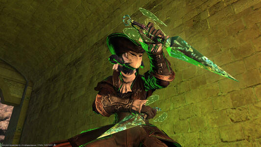
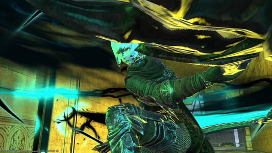
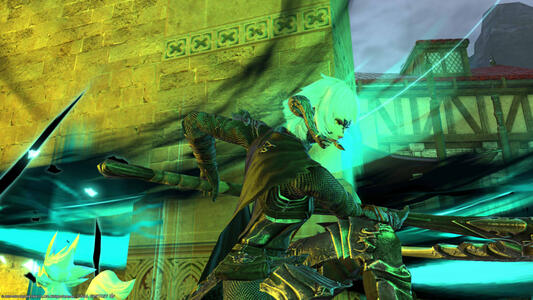
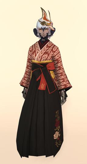
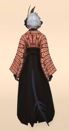
These screenshots are taken terribly by me with gpose, no mods or shaders are used
Please do
Provide clear references of your characters, with neutral lighting and plain background where possible.Provide them as a compiled image or individual images in a shareable public link
eg: gdrive/imgurPlease provide minimum full body:
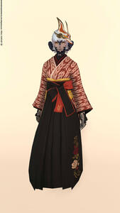
- Front
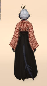
- Back
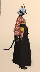
- Sides
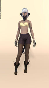
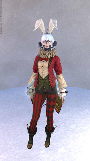
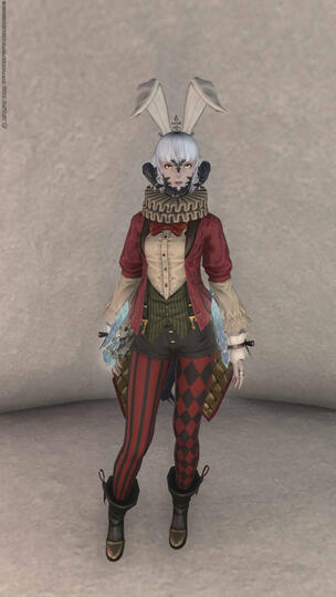
(L + R If they are not symmetrical)As clothes will obstruct or overlap, please undress your character to provide more reference screenshots such as gloves/shoes/hair as needed.Per the example below, the dress coves the shoes, and the last image the dress is removed to show her shoes and pants.
You may add as many close up screenshots of items/details as you deem important or overlooked.
E.g: 3/4 view references, underside of the gloves /
shoes (that are covered by other clothes) / accessories / etc.It will be helpful to list the item that they are wearing.You may add in other mood/fun images to depict your character's personality in addition to the references.
Understand that I have NEVER seen your character before and will not know the details/intricacies
(no matter how common certain clothes/hairstyles are being used)
Please Refrain From
only sending:
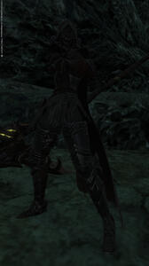
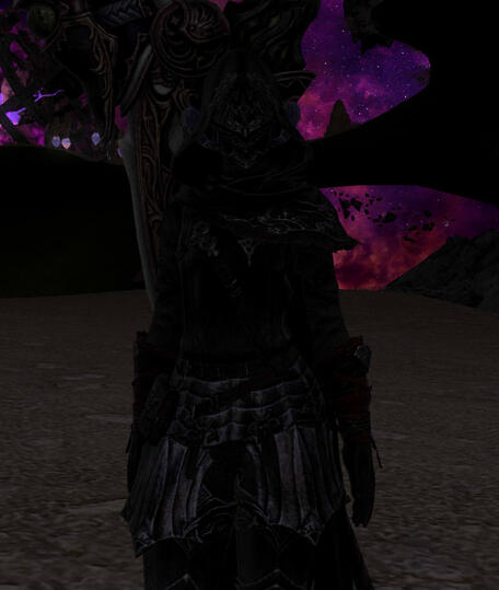
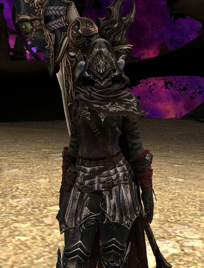
- Dark images as references as they are hard to see.
- Using angled screenshots
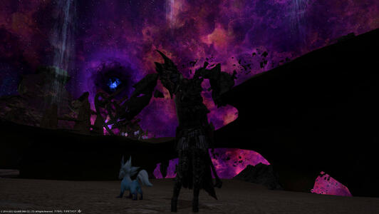
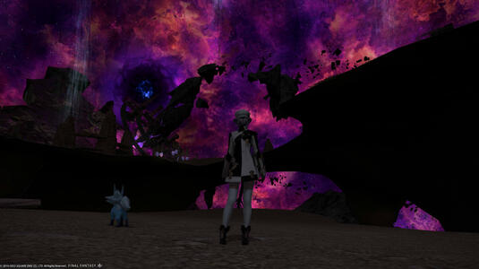
- Dramatic lighting.
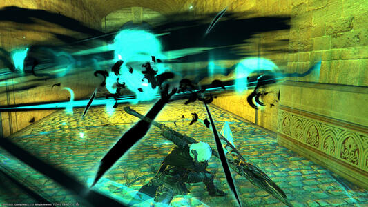
- Action posesIt is alright if clear references are already given and these are for flavor/understanding the character's personality/specific details.Some extreme examples are as such:
- Colored / Bright / Dim lighting = inaccurate armor/skin tone
- Visually obstructs other parts of the body
lighting difference:
Dim vs Visible:
Armor details/texture can be clearly seen
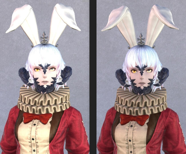
Bright vs Neutral:
-Visible difference in skin color and clothes.
-Loss of detail on the rabbit ear's in bright lighting.
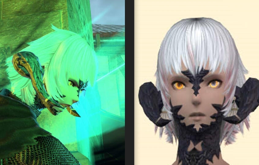
Colored lighting Vs Neutral:
- Clear difference in hair color / skin / horns
Background choices
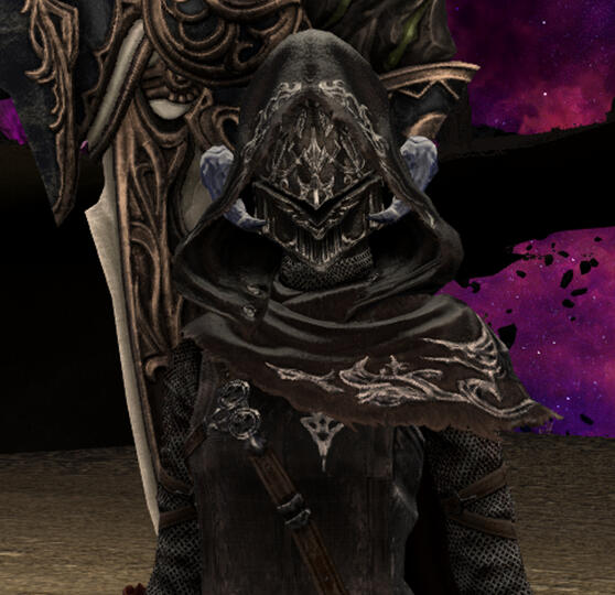
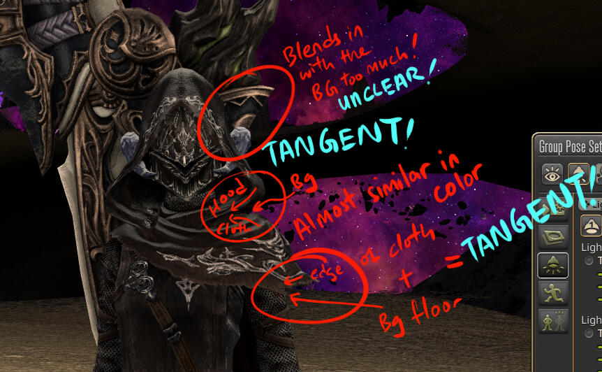
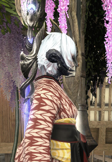
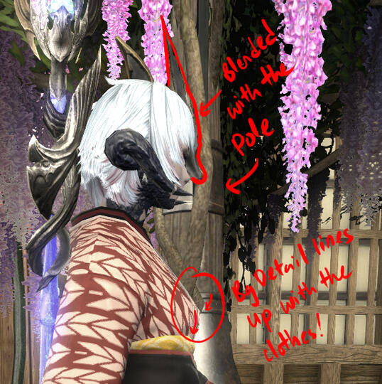
Busy backgrounds causes confusion :
-As it blends into the character's shape / color choices.
In this example:
- Back of the mask's color is similar to the pole in the background.
Making it hard to see notice that the mask is there.
- The detail on the pole flows directly to the character's clothes, causing possible confusion.
Setting up, character specifically
**I dont know about weapon posing, sorry
if you have a house/apt/private fc room
Big thanks to @aerisviel on twitter for their original guide
Which I followed to bring you this as well
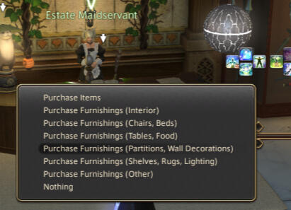
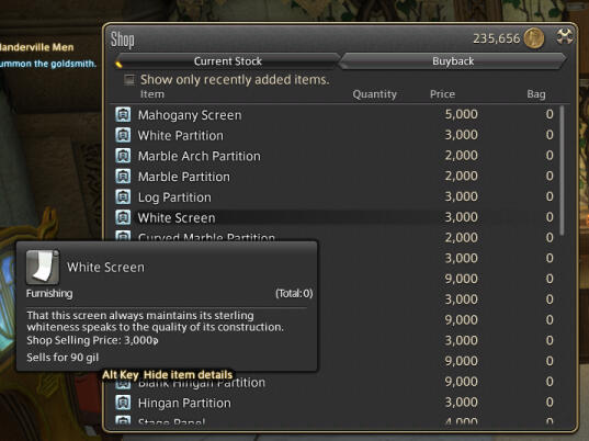
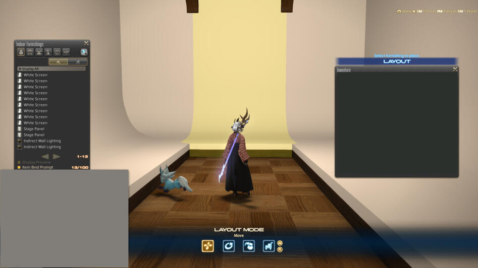
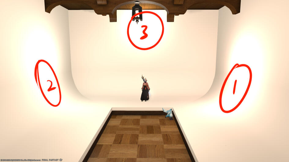
Housing merchant > under furnishings for partitions, wall decorations > white screen, you'd need at least 3 or 5 depending on how you'd want to arrange them in the room
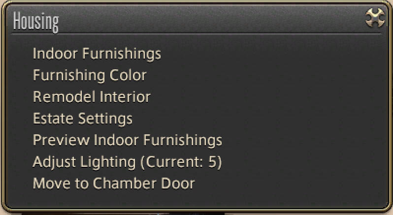
you'd want to arrange them as such, and leve the room lighting to maximum at 5, or at least I did
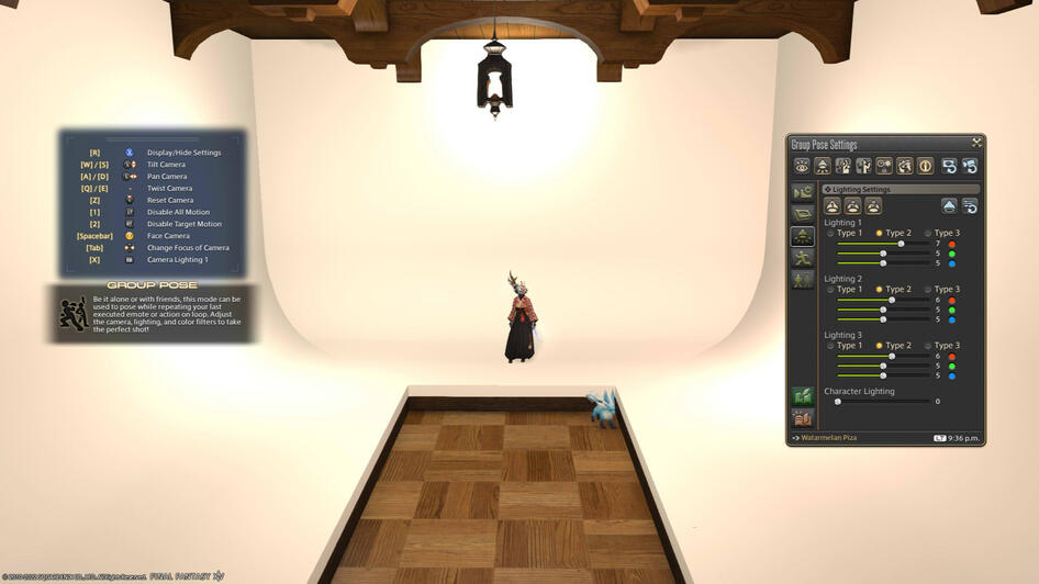
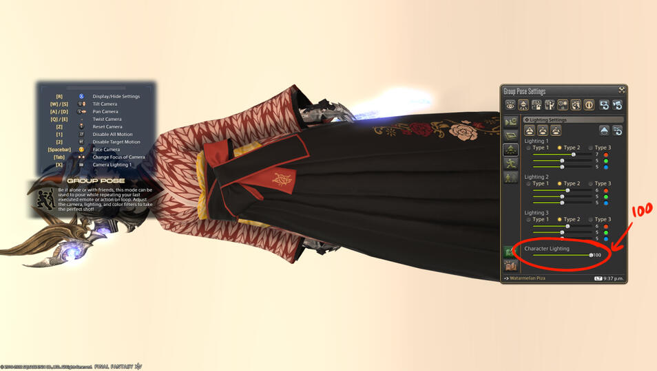
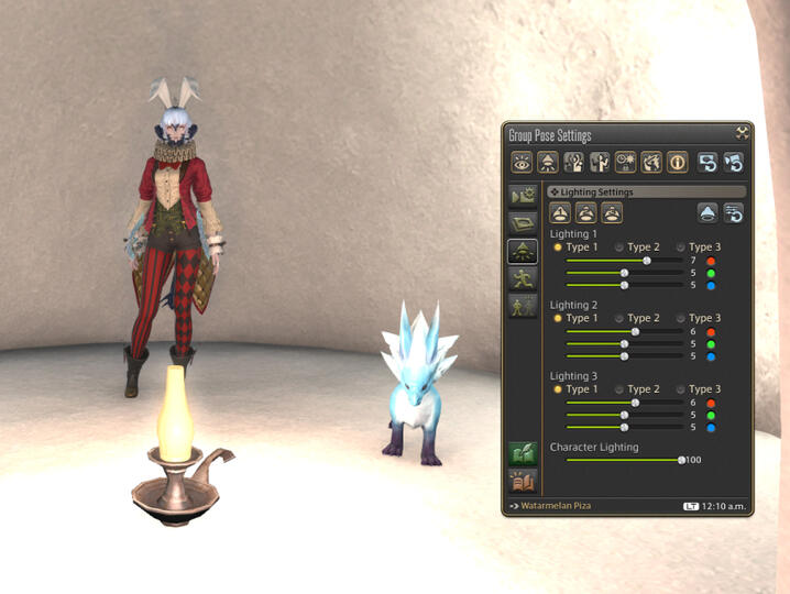
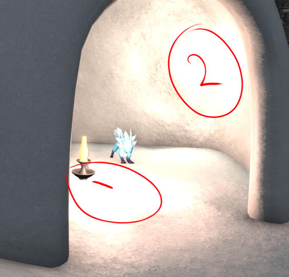
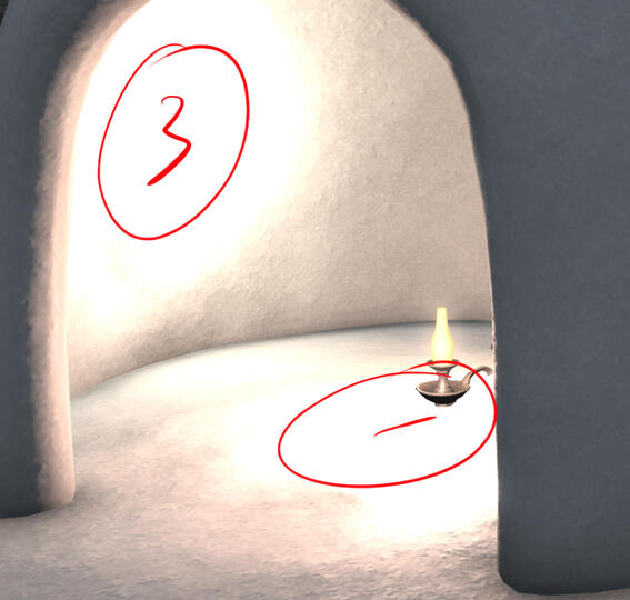
Do 3 point lighting in gpose, I left the lights on type 2, since type 3's lights are too strong.
Or however else you'd want to, as long as your character is sufficiently lit.
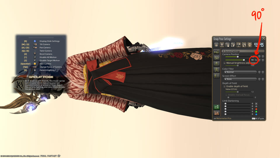
Rotate your camera by 90 degrees, so that they would fit the length of the screen rather than width.
Zoom in to your character and try to frame them to fit into the screen as much as possible without being cropped. If your character benefits from character lighting being bumped to a 100, please do so.
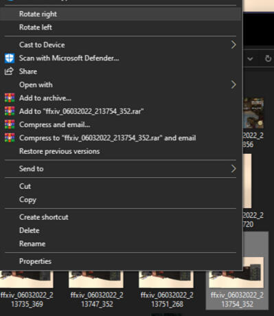
After hitting the screenshot button, go to your screenshot folder, (windows) right click on your image, and you should have the option to rotate the images. Rotate them to get them to the right orientation!
if you do not own a place
You may go to:
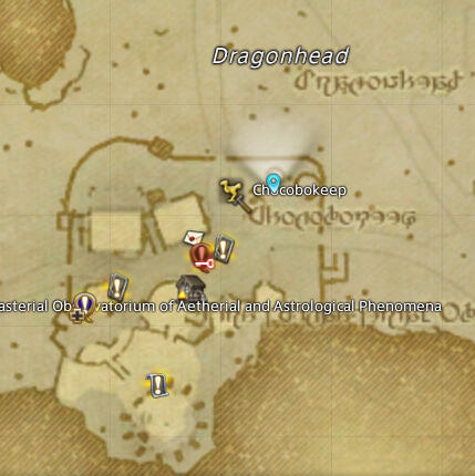
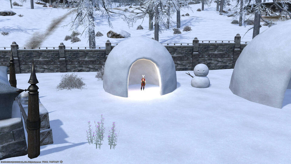
Coerthas central highlands, camp dragonhead
or
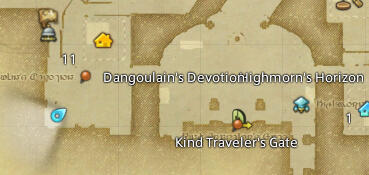
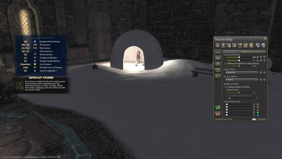
Foundation, residential district (any)
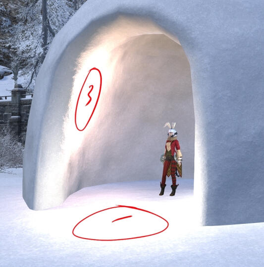
You should be able to spot these igloos respectively to use as your plain bg should you choose to.
Coerthas's igloo is bigger.
However, you are at the mercy of the day night cycle for lighting, as you can see the difference of daytime coerthas vs night time ishgard housing.
What I did for Coerthas, lighting and setting:
What I did for ishgard's housing, lighting and setting:
because the igloo is smaller, I changed the lighting to type 1
Hope it helps
